ATU Sligo App and Web Development
Use Case Study for ATU Sligo Website Redesign and Student-Centered Application
OVERVIEW
Being a student at ATU Sligo, I have extensively utilized the university's website for various tasks, such as accessing course materials, booking library rooms, and checking exam results. While the website was generally usable, it was plagued by slowness and lacked sufficient accessibility features. One major pain point raised by fellow students was the difficulty in finding and accessing exam results. In response to these challenges, my team and I embarked on a case study to improve the overall user experience and make the website more accessible and user-friendly.
ROLE
UX/UI Designer, UX Researcher
User Research, Interaction, Visual Design, Web Development, Prototyping & Testing
January - May 2022
The Process
Empathy Stage
Desk Research
By conducting desk research, I evaluated the current time required to retrieve my exam results and book appointments for feedback and counseling sessions. The entire process involved several steps, including finding login access credentials, locating the link to access exam results, and finally accessing the exam results page. The time taken for this process was approximately 5 minutes.
During interviews with students regarding the current process, they highlighted various user pain points, including frequent website crashes and a perceived lengthy process. As a result, students' mental models regarding the user journey were predominantly negative. However, amidst these challenges, we were able to identify clear and identifiable user goals that emerged from this process.
Competitive Analysis
To determine the best approach for creating a user-centered application, I conducted extensive research by examining various college websites and applications available on the IOS store. The primary objective was to identify if any colleges had successfully developed robust and student-centered applications.
After a thorough investigation, it became evident that the current landscape of college applications is still in its early stages of transitioning into fully student-centered apps. While some progress has been made, many applications are yet to achieve a truly user-centric design that caters to the specific needs and preferences of students.
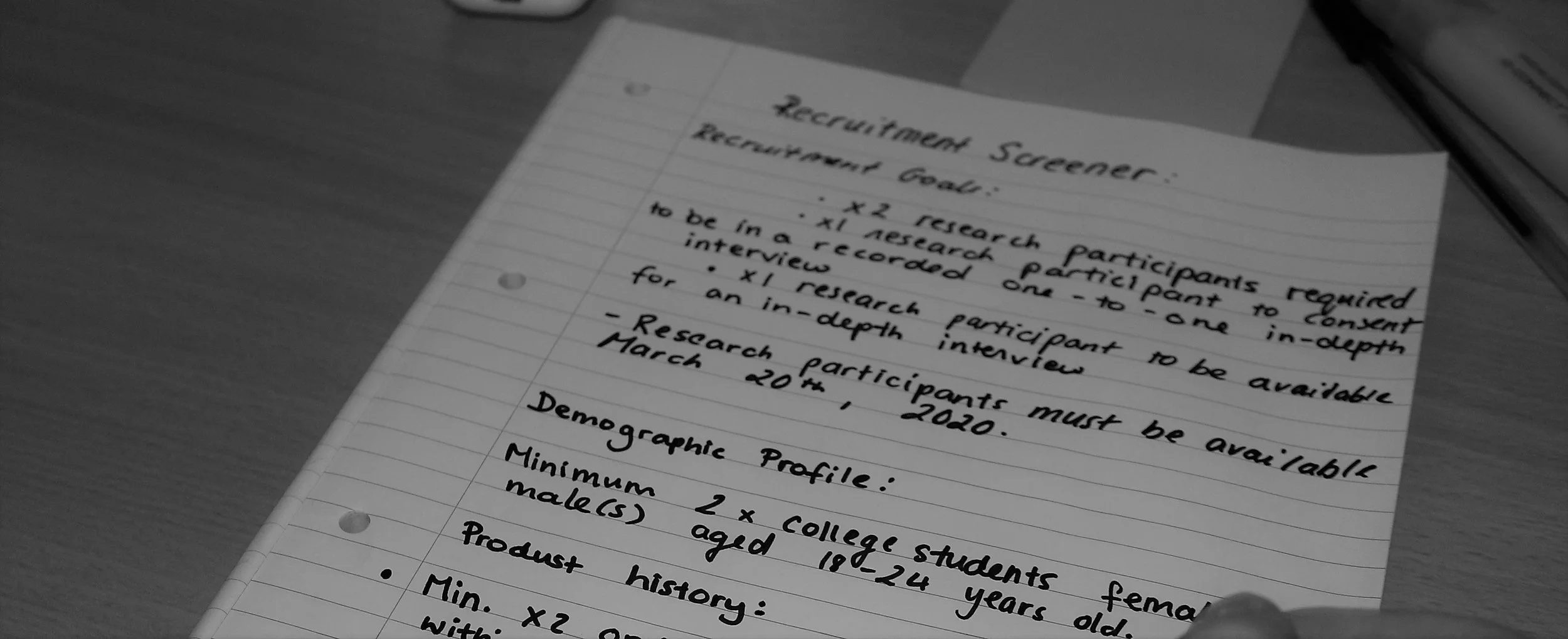
Recruitment Screener
I developed a recruitment screener by first defining and establishing specific criteria, including use cases, product history usage, and technological proficiency. Subsequently, potential interviewees were identified based on these criteria and were then contacted for the screening process.
Usability Testing
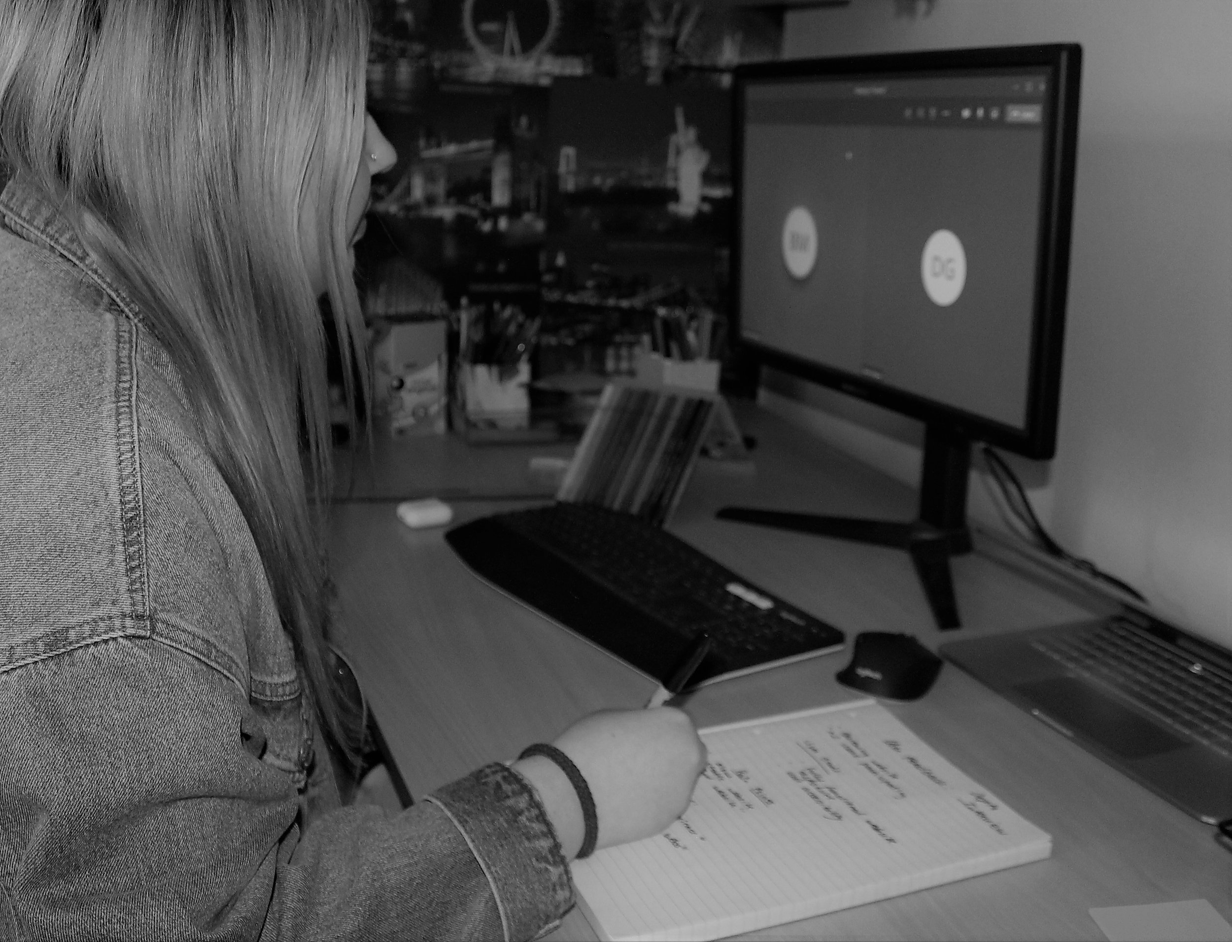
Ten research participants were interviewed, observed and recorded as they navigated through the IT Sligo website. They were asked to complete a list of tasks such as:
· Find exam timetable
· Find exam results
· Where on the website is student supports?
· What does GPA mean?
· Where can you find exam information?
Qualitative research notes were transcribed.
Depth Interview
A further interview script was prepared in order to establish the context of people visiting college websites, clarifying user goals, tablet or mobile usage, place and time.
During the Empathy stage, I carried out the various tasks listed above. I began with some desk research and competitive analysis on other college websites and applications. I then created a recruitment screener and conducted usability testing and in-depth interviews.
Define Stage
Online Survey
Surveys were conducted to corroborate user frustrations. Questions were determined from prior interviews, quantifying rich qualitative research.
Questions included:
· Why did you access the college website?
· Were you able to complete your task? If not, please explain
· How do you access your exam results?
· Do you understand the term 'GPA'?
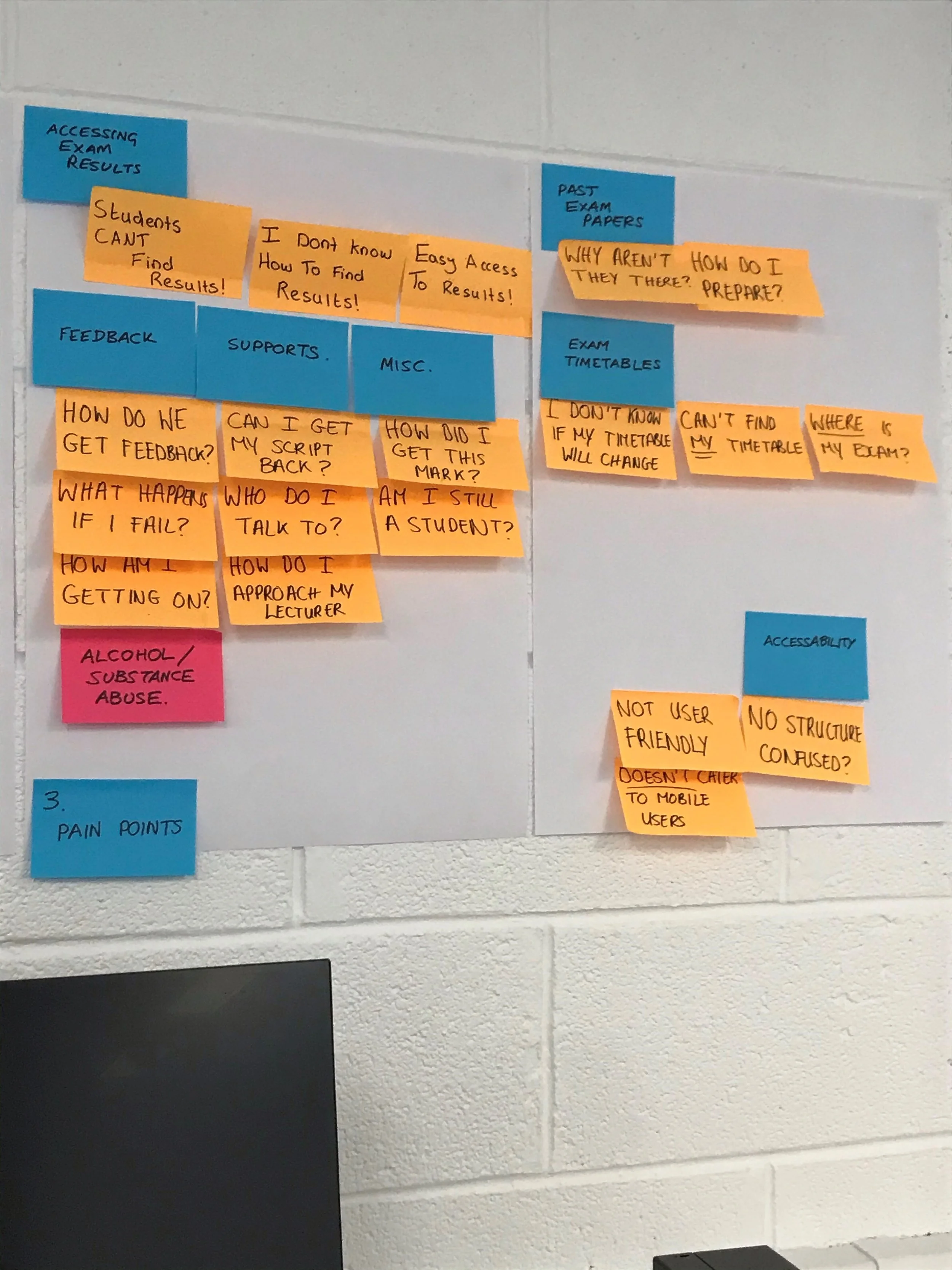
Empathy Map and Affinity Diagram
Qualitative and quantitative research of what was learned so far, was displayed graphically, culminating in user pain points and goals. (see below)
User Persona
From my research, I developed user personas inspired by the students at IT Sligo. The user persona I constructed was founded upon students who engage with the college website daily, particularly those who have recently attempted to access their exam timetables and results. Among these students, there were individuals with visual impairments who depended on voice technology to assist them in navigating certain aspects of their online experience.
Wireframes
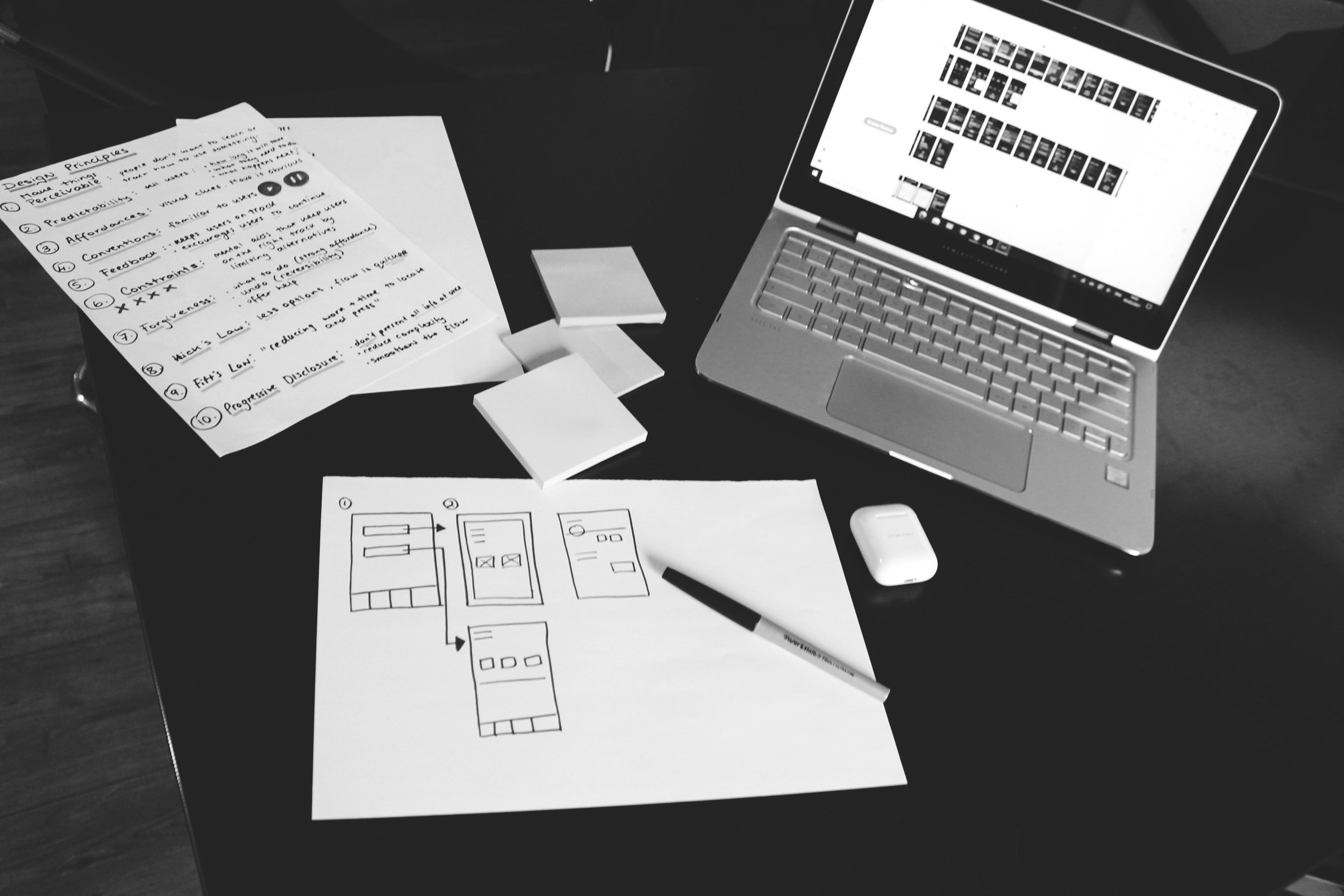
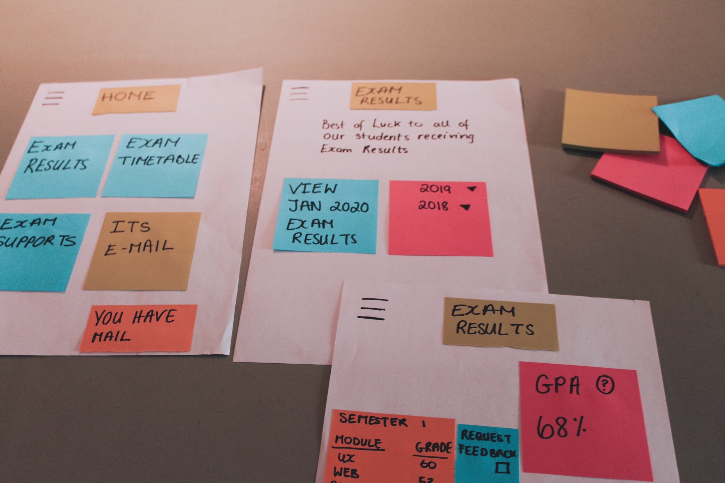
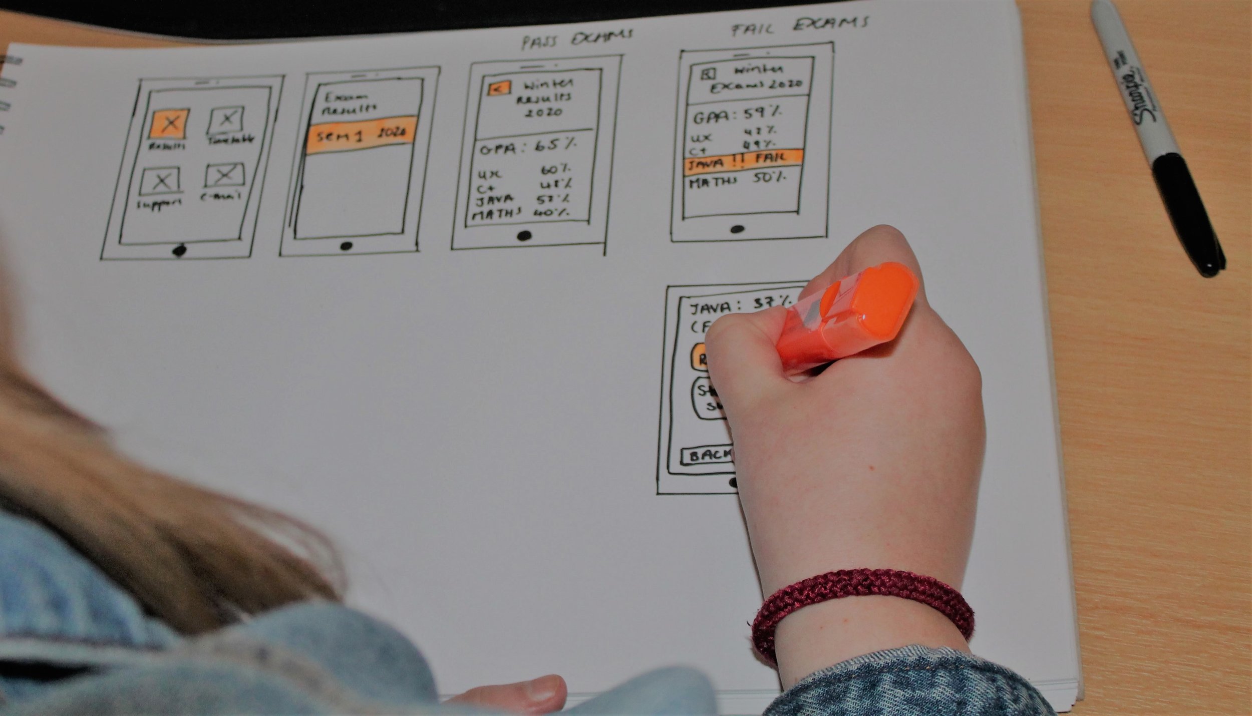
I crafted initial paper wireframes and subsequently transformed them into an interactive prototype using the 'Marvel' app.
During the Define stage, I was able to apply my findings and user feedback to my tasks. To help me define user goals and user pain points, I created an affinity and empathy maps. Lastly, I created user personas and wireframes to help build the foundation of the application.

Ideate Stage
Define Navigation
Upon consideration of flow diagrams, a navigation style was deliberated and defined from best practice that would accommodate the users flow through the desktop website.
Information Architecture
Lo-Fidelity Prototype
Sketched screens and states were photographed and inserted into Marvel app for usability testing purposes. Research participant feedback was noted.
Design Thinking Principles
To help build a blue print of how the application would work, I created a user flow, navigation through Information Architecture and by doing this, I created a paper based prototype. By using the Marvel app, I was able to make it interactive and test it out on users. After conducting usability tests, I was able to get feedback and make iterations. By applying the design thinking principles, I was able to ensure I create a seamless experience for the user.
Prototype and Test Stage
Mid-Fidelity Prototype
When creating the Mid-Fi prototype, I focused on the functionality rather than the design. This made the process easier to work on with no distractions of icon or colour schemes. I created my prototypes in Adobe XD.
Based on the feedback I received from users, I made some minor changes to the prototype. I added more screens and created four categories. Exam results, exam timetable, student support and student e-mail.
UI Design
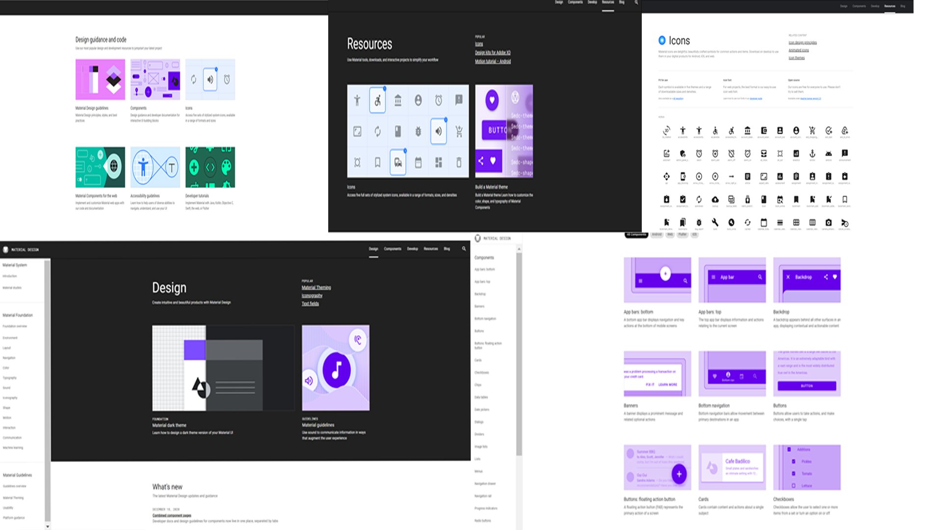
Inspired by interviewees to create the excitement, look and feel of browsing through glossy magazines, a visual style guided by Material Design was adopted.
Hi-Fidelity Prototype
Following mid fidelity product development, Adobe Photoshop documents were precisely rendered in Adobe Illustrator and exported as SVGs for testing via Adobe XD.
Testing
Further usability tests were conducted on the the consequent high fidelity prototype. Research participant feedback was noted and incorporated into further product development.
Tasks such as finding exam results and exam timetables increased by 200%.
What Students Are Saying
“It makes the process stress free and only takes half the time to find my results.”
— Hannah Byrne. Student
“I like that I can have everything in one place without having to click into lots of tabs. This app is a want and need .”
— Clara Monterio. Student


