LIA (Life Insurance Association)
OVERVIEW
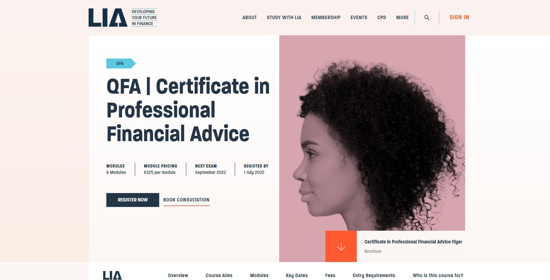
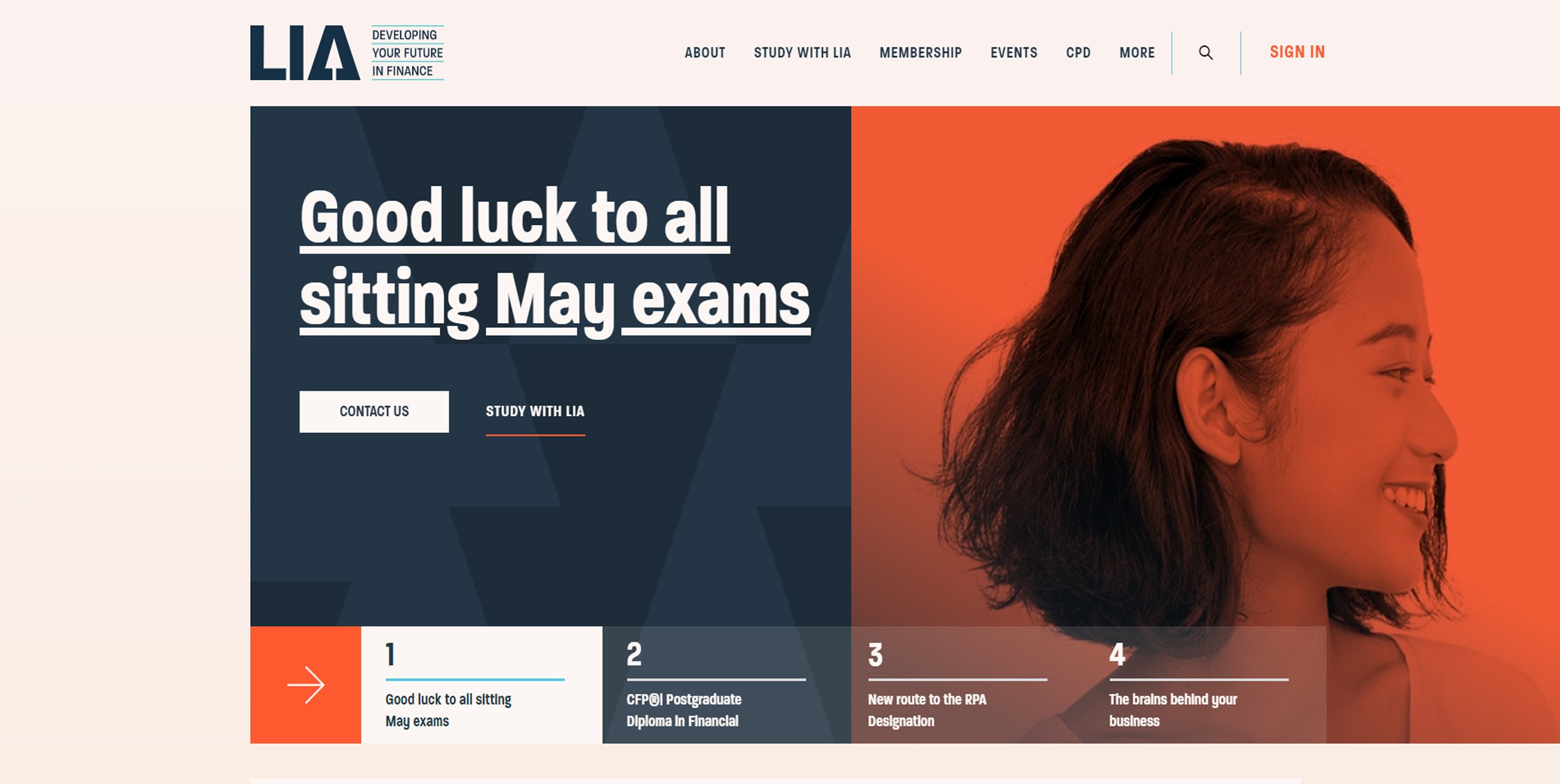
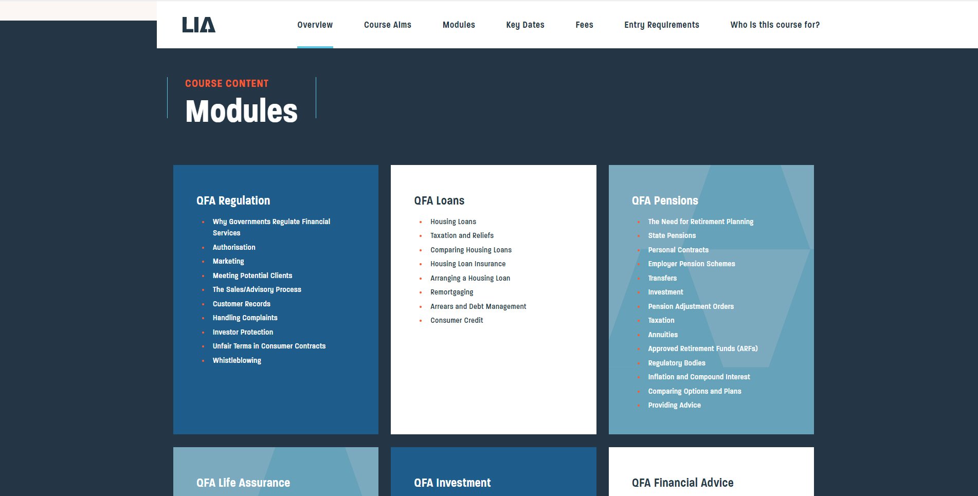
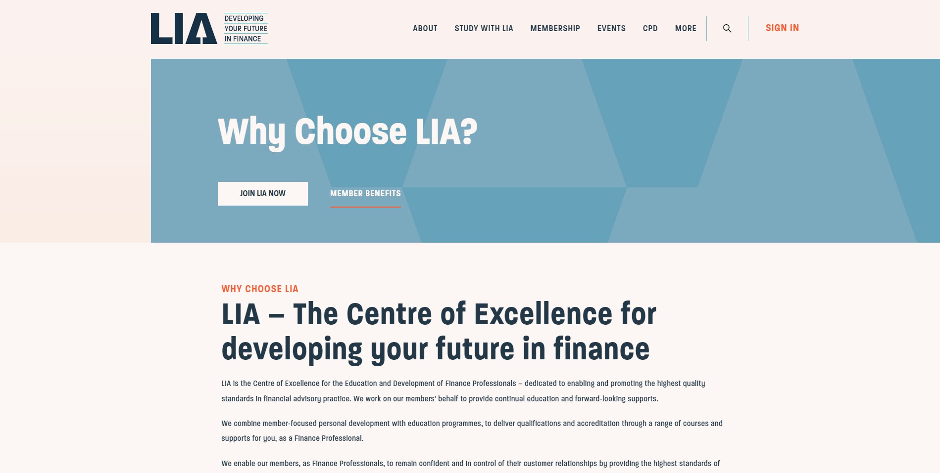
I worked on enhancing the user experience by creating a modern education app and revamping the LIA website. I developed guidelines for content governance, focusing on tone, style, and voice consistency. Also, crafted design specifications and tailored content to align with the brand's customer personas while ensuring our content strategy aligned with business objectives.
Content Strategist, Content Designer
User Research, Interaction, Content Design, Prototyping & Testing
January - May 2022
GOALS
The primary objective was to revamp the website and application to capture the essence and expertise of LIA as an organization. The aim was to ensure that prospective students could easily grasp the value of studying with LIA.
Content played a significant role in our focus, and we preserved the core elements of the visual style (like illustrations and brand colors) to maintain LIA's unique identity among other financial insurance courses in the market. However, during the course of the project, I identified crucial pain points related to usability testing.
Therefore, we expanded the project scope to address internal usability requirements while still refreshing the content and visual style of the site. Our goal was not only to enhance the site's presentation but also to revamp the registration and enrollment process.
PROCESS
To kick-start the project, I started with competitive research, ensuring alignment with the company's goals, and delving into the brand manager's vision for the future updates of the site and app.
My objective was to identify the necessary enhancements and additions to both platforms, enabling potential students and employees to easily grasp the company's accomplishments, values, and core competencies.
Since the agency's values were already established, I engaged in discussions with the brand director and brand manager to gather their insights on the agency's strengths and brainstormed ways to effectively communicate them to students in a concise and easily digestible manner.
Next, I established a comprehensive timeline to ensure that all planned tasks aligned with the new launch deadline. Collaborating closely with the team, we reviewed and curated icons and artwork that would reinforce the desired tone and visual brand, setting LIA apart from other education professionals.
In close collaboration with fellow content strategists, we assessed and made necessary adjustments to the written content, adding, removing, and updating as needed.
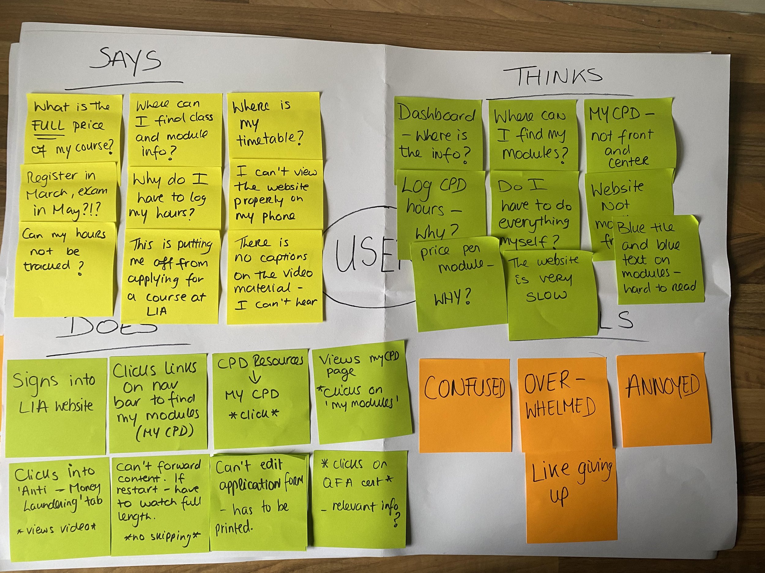
To tackle the design aspect of the project, I used Adobe XD as my primary tool. In my quest to elevate the design, I prioritized two key elements: consistency and usability. By creating reusable components, I ensured a consistent look and feel throughout the project.
Throughout the iterative process, I continuously updated the designs based on rapid user testing of the prototypes. I started the design journey by gathering initial feedback from the team through sketches. Even after the designs were developed, I actively sought and incorporated ongoing feedback to refine and improve the overall user experience.
Visual Thinking on Paper
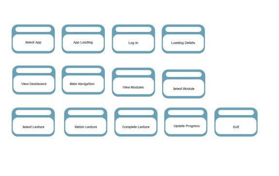
To gain a comprehensive understanding of the enrollment and registration processes, I mapped out the workflows using Adobe XD. This exercise proved instrumental in identifying the specific touchpoints where users interacted with the system. By visually mapping the processes, I gained valuable insights into the user journey and potential pain points.
Sketching Interfaces
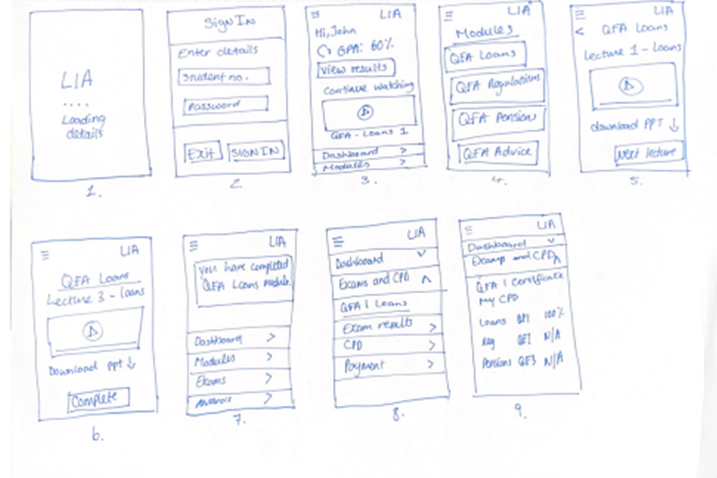
Rather than relying on wireframing, I took a different approach and sketched my designs on paper. Leveraging paper prototyping techniques, I brought the designs to life and actively engaged our users for evaluation. This method allowed for rapid iteration and encouraged the exploration of multiple ideas. By sketching numerous concepts, I gained a broader perspective of the system early on, ensuring a more cohesive and comprehensive design approach.
Hi-fidelity Mock-ups
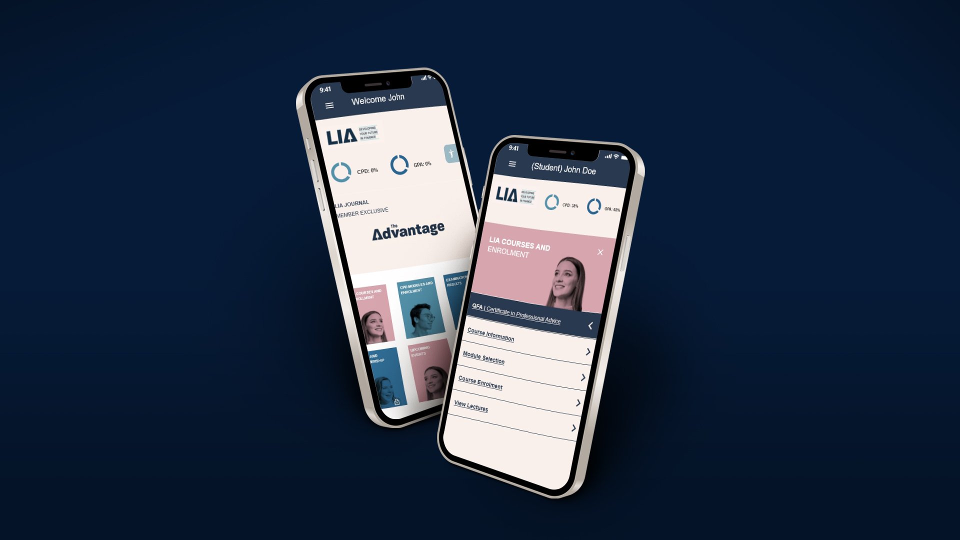
To advance the design process, I used Adobe XD to develop sets of detailed mockups. This approach proved invaluable in showcasing the design progress and allowing the brand manager to witness the iterative journey towards finalizing the app and website designs. It provided a concrete visual representation of the evolving design and facilitated effective communication and decision-making throughout the project.
Prototyping and Usability Testing
Through face-to-face communication, we effectively conveyed requirements, discussed constraints, and explored possibilities, allowing us to address the intricacies of Interaction Design. We fostered a collaborative environment where constant testing and progressive iteration were key components of our process. This dynamic approach ensured that we continuously improved and refined the user experience.
Metrics
During the usability testing phase, the interviewer observed and timed task one and task two. Both tasks were conducted and recorded, starting with the usage of the LIA website, followed by the mid-fidelity prototype. This approach allowed for direct comparison and evaluation of user interactions and performance across both platforms.
Task 1
As a member I want to be able to complete a CPD module on my tablet in order to earn CPD hours while travelling on the train from Dublin to Portlaoise.
(Backend – App)
Time: 8 minutes (480 seconds)
Mid Fidelity Prototype
Time: 1 minute (60 seconds)
Results: 800% faster
Task 2
As a student I want to listen to / look at pre-recorded webinars in my student resources on my phone in order to progress on the course I am studying while out
for a walk.
Time: 6 minutes (360 seconds)
Mid Fidelity Prototype
Time: 1 minute (60 seconds)
Results: 600% faster


