Improved Customer Experience for the ZARA Website
Case Study | UX Tree
🏅 Best Research Award - 🏅 Best Mentor & Mentee Award
Overview
While Zara claims to put customers at the centre of their brand, users online have expressed difficulties and issues in the usability of Zara’s site, including some of my friends and co-workers. This prompted me to evaluate Zara’s online presence and find a way to improve their site while working within their established brand and creative direction.
38% of monthly website users access the website on desktop (Approx. 24 Million Users).
Project Focus
The primary objective of this project is to alleviate user frustration by strategically reducing cognitive overload and enhancing intuitiveness through clear affordances.
The focus extends to streamlining navigation for a more efficient and satisfactory product discovery and purchasing process.
Target Audience:
Tech-savvy, fashion-conscious individuals aged 18-55.
Specifically addressing users unfamiliar with the ZARA website.
Role
UX Researcher, UX/UI Designer
User Research, Interaction, Usability Testing, Visual Design, Prototyping & Testing
September 2023 - December 2023
Design Process
I conducted two rounds of research and ideation using the Double Diamond process to refine the design.
Research
Desk Research:
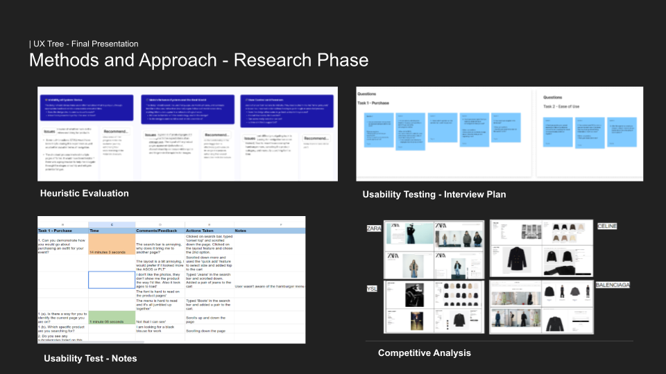
Starting with the Zara website, I wanted to conduct a cognitive walk through first.
After analyzing the site, my findings were:
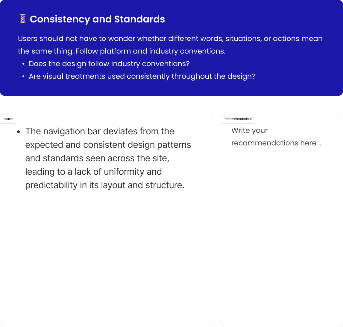
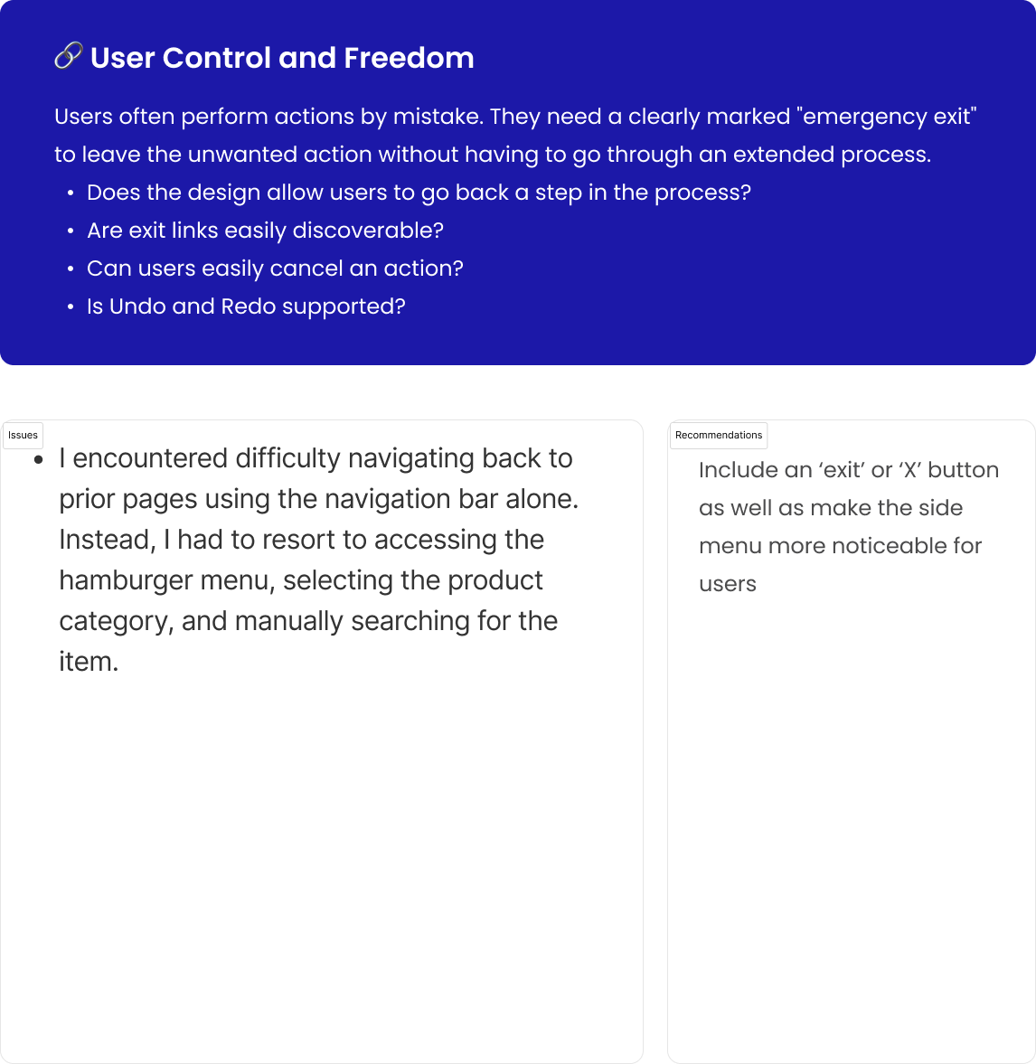
The navigation bar is displayed twice with one being concealed within a hamburger menu
The navigation bar is unorganized and provides too many options leading to cognitive overload.
The search bar redirects to a separate page causing confusing.
Non-clickable links which also led to confusion.
Images on the homepage swiping causes distraction.
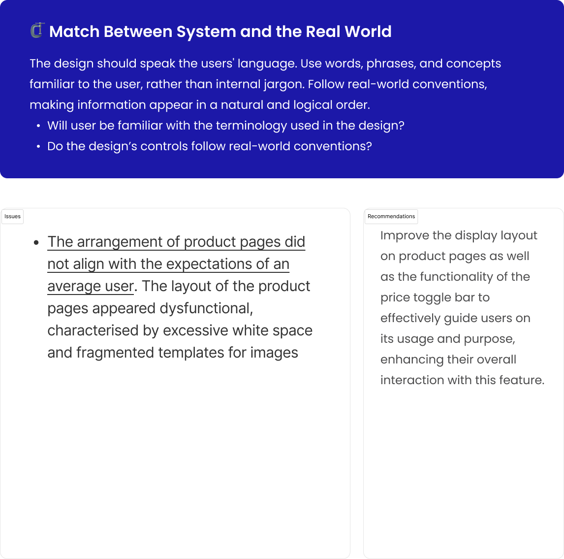
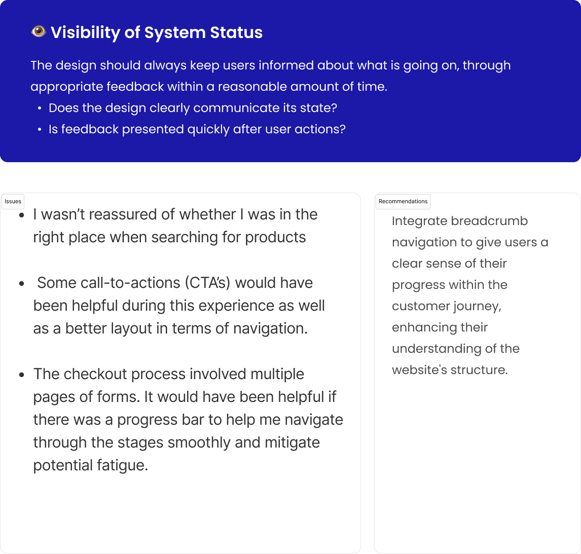
Heuristic Evaluation:
Figma file.
Competitor Analysis
After conducting thorough research, I identified several websites that closely echoed the aesthetic ZARA is aiming to cultivate. Notably, these brands are recognized as high-end, luxury establishments. What struck me was the remarkable resemblance of these websites to ZARA, particularly in their utilization of small font in all capital letters, a catalogue-like appearance. However, it was noteworthy that these sites exhibited a more refined and better-categorized navigation system compared to ZARA.
There may also be a misalignment with customer preferences. Luxury brand customers, such as those of CELINE, YSL, and BALENCIAGA, often prioritize in-store experiences to physically engage with products before making significant purchases. Consequently, luxury brand websites have lower conversion rates compared to more affordable options like ZARA.
ZARA's deliberate decision to maintain its current website design suggests an intentional strategy. While they have the resources to enhance it, ZARA may be encouraging customers to visit physical stores for a more immersive experience. The distinction lies in the retail experience; luxury brand stores offer a controlled, exclusive environment with attentive service, contrasting with ZARA's more accessible but potentially busier and chaotic stores. This difference in shopping environments may impact customer satisfaction, prompting consideration for ZARA's unique approach.
User Interviews
I wanted to identify what the majority of people thought about the current desktop experience of the Zara website.
Users: 6 users
Key Insights:
1. Users encountered challenges with the website navigation and product search, leading to a notable cognitive overload.
2. All participants dedicated over 10 minutes to find desired products. Issues such as an uncategorized navigation bar, confusing search system, lack of information, and a confusing layout contributed to this prolonged search. The lack of intuitiveness was a consistent highlight.
3. 100% of participants were unable to determine their location on the site, emphasizing the impact of the absence of breadcrumbs on user navigation and orientation..
4. All participants unanimously expressed a preference for in-store shopping and conveyed a strong reluctance to return to ZARA's website for future shopping experiences.
5. 84% of participants faced challenges when attempting to modify the layout of the product pages.
Define
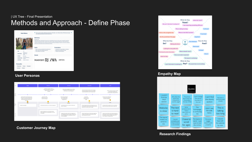
User Personas
Based on the research I conducted, I identified two user personas.
Persona 1: Busy woman with little time to shop in-store, orders online for convenience.
Persona 2: Active college student with limited shopping stores in his area.
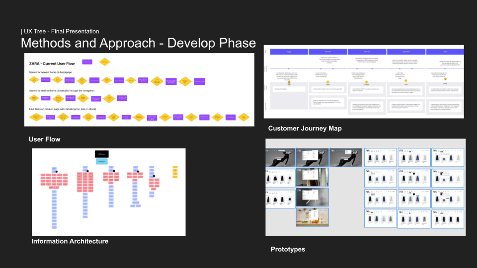
User Flows
I analyzed the existing user flow for three specific tasks on the current website:
1. Searching for the Newest Items on the Homepage.
2. Navigating to Desired Items Through Website Navigation.
3. Locating Items on Product Pages with Detailed Information (Price, Size, In Stock).
The current user flows involved numerous steps, resulting in confusion and cognitive overload. The abundance of options and a lack of organization within menus and product pages contributed to this challenge. In contrast, the final prototype streamlined the process by reducing the number of steps. This optimization resulted in faster task completions for users, eliminating cognitive overload and confusion. Users could now accomplish tasks more efficiently, experiencing a smoother and more user-friendly interaction with the website.
Problem Statement
The current user experience the website offers is plagued by significant challenges, resulting in user frustrations during navigation, product discovery, and the completion of purchases.
Why is it a Problem?
This deficiency not only burdens the user with cognitive overload and a lack of intuitiveness but also presents a substantial risk to brand loyalty and revenue potential, stemming from persistent issues in the online customer journey.
Because of this, the bounce rate for the Zara website is 60% as well as cart abandonment at 98%. This directly impacts ZARA's online sales performance, a vital revenue stream for the business, with an estimated loss of revenue from nearly 24 million desktop users worldwide.
Project Objectives:
1. Intuitiveness:
Provide affordance for completing tasks with ease such as browsing and product discovery.
Reduce cognitive overload by reducing the amount of steps to complete an action as well as improving time of task.
2. Navigation:
Enhance ease of navigation by rearranging the site navigation.
Implement noticeable prompts like clickable links and legible text.
3. Visual Appeal:
Maintain alignment with the brand's creative direction.
Ensure a visually appealing experience without compromising brand identity.
Design
The main areas I focused on during my design process was:
Information architecture
Navigation menu
Homepage
Product page layout
Goal: Reduce Cognitive Load, Provide Affordance and Assurance for Users
Every step adds to cognitive load.
Highlight clickable links to avoid confusion.
Streamline actions to prevent cognitive overload and process abandonment.
Ideation
Identified my vision for the website as follows:
"The website will provide users with affordance and intuitiveness to discover and search for their desired items without experiencing cognitive overload or feel overwhelmed."
After establishing this vision, I began the ideation process. Following the testing of the high-fidelity prototype, I implemented iterations to the product pages and main navigation. This involved enhancing affordance even more for users by refining their selected options within the filters and integrating improvements within the main navigation menu.
Low Fidelity Design
View low fidelity prototype.
The objective was to revamp the existing navigation menu and product pages with the aim of establishing a more organized and intuitive structure. Through the implementation of a categorized navigation bar, the goal was to create a smoother user flow, ultimately reducing cognitive load. This approach not only provided clear affordance for users but also significantly enhanced discoverability, ensuring a more seamless and user-friendly experience.
Hi-Fidelity Prototype
View high fidelity prototype.
Adhering to the essence of the ZARA brand, the ultimate design not only elevated the existing user experience but also addressed the identified pain points discovered through research and testing.
These subtle yet impactful changes contribute significantly to fostering a positive user experience on the ZARA website.
Testing
In the final testing phase, I conducted a usability test comparing the existing ZARA site with the prototype I developed.
Participants were tasked with performing identical actions, followed by a series of questions from the System Usability and Likert Scales.
Results
The results from the Systems Usability Scale (SUS) and Likert scale tests indicated that the current ZARA website falls short in terms of user confidence to complete tasks due to a lack of intuitiveness.
The site was perceived as complex, exhibiting inconsistencies, and proving challenging to navigate.
On the Likert scale, users expressed dissatisfaction with their overall experience, highlighting difficulties in the discovery process and an unwillingness to recommend the site to others.
Task 1:
Discoverability: Locate a pair of black trousers and select your preferred size without utilizing the search bar.
Time: (Current Zara Website) 10 minutes 8 seconds
Time: Final prototype: 1 minute 5 seconds
Task 2:
Affordance: Without utilizing the search bar, locate a pair of blue work shoes and select your preferred size.
Time: (Current Zara Website) 4 minutes 39 seconds
Time: Final prototype: 1 minute 2 seconds.
Conclusion
Conclusion
Main Learnings:
The importance of clear call-to-action elements cannot be overstated; they serve as the user's expectation-setting mechanism. Clarity in conveying what users can anticipate after clicking is crucial to avoid disappointment or confusion. Additionally, it's essential to recognize that not all UX methods are universally applicable across all projects.
Next Steps:
Given the insights gained, it's apparent that further exploration is warranted. While existing case studies on ZARA's website are abundant, I plan to revise and extend my own case study. This involves delving deeper into understanding the rationale behind ZARA's online experience design decisions, potentially culminating in an article. My focus will extend to scrutinizing the checkout experience, aiming to comprehend its current state and identify opportunities for improvement based on my research findings.
What I Would Do Differently:
Enhanced Usability Testing:
Conducting usability testing with diverse user groups would provide a more comprehensive understanding of user needs.
In-person usability testing is essential, particularly for users requiring additional assistance, to address challenges effectively.
Focus on Accessibility Features:
Recognizing the necessity for a more concentrated approach to accessibility features is crucial, even within limited project timelines.
Final presentation link.


