EasyTravel
OVERVIEW
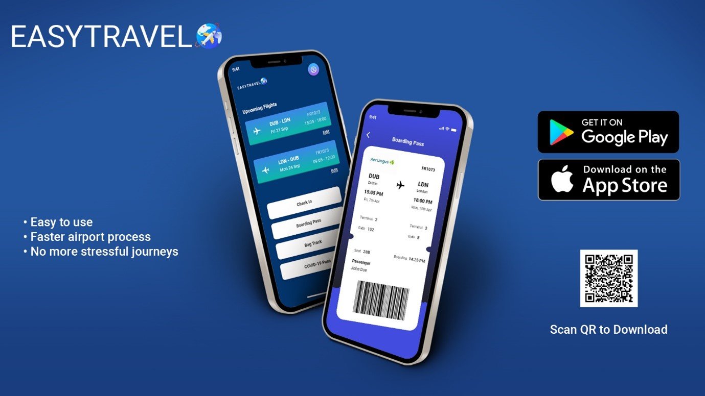
As part of my final year project as an undergraduate student at ATU Sligo, I developed an application called
EasyTravel. This app aims to enhance the passenger experience (PX) within airports, particularly during the
challenging times of the Covid-19 pandemic. It offers practical solutions to address the unique needs
and concerns of travelers.
ROLE
UX/UI Designer, UX Researcher
User Research, Interaction, Visual Design, Prototyping & Testing
January 2022 - May 2022
Problem
My project centered around Dublin Airport, which garnered significant negative media attention in March and April of 2022. Passengers took to social media to express their discontent and frustration with issues such as overcrowding, lengthy queues, temporary unavailability of fast track services, and a lack of real-time information provided to them. Understanding these challenges, I aimed to address these pain points and improve the overall airport experience through my project..
Scope
My main goal was to create a user-friendly application that effectively addressed the current pain points in the passenger journey. By applying UX principles and conducting in-depth interviews, I identified and established the essential features required for this application. Through a thoughtful design process, I aimed to tackle the challenges head-on and provide practical solutions to enhance the overall airport experience.
Roles
User Research
UX/UI Design
Information architecture
Content Strategy
Visual Design
Tools
Adobe XD
InVision
Miro
Paper
Photoshop
Material.io
The Design Process
I conducted a twelve-week design sprint based on the design thinking methodology that includes 5 stages – empathize, define, ideate, prototype and test.
Gathering insights
Once I gathered the recordings from the user interviews, I began working affinity mapping techniques to synthesize the identified pain points. This involved grouping the problems into common themes and features within the platform.
To prioritize and address these usability issues effectively, I adopted a data-driven approach called the severity framework. This framework enabled me to assess the severity score of each usability issue based on three key variables. By leveraging this methodology, I ensured a systematic and informed process of resolving the most critical concerns.
Task criticality x impact x frequency = severity
Task criticality - how important is the task to the user? (1 = low, 5 = critical)
Impact - how much of an impact does this issue have on the user's task? (1 = suggestion, 5 = blocker)
Frequency (%) - how many times does this come up out of total participants?
Empathy
To gain insights into EasyTravel's competitive landscape, I performed a competitor analysis on key players such as DAA, Ryanair, and AerLingus. This assessment allowed me to understand what they were doing well, areas where they fell short, and potential gaps in the market.
One significant observation I made from this analysis was the absence of direct competitors in the market. While there were existing players, their focus primarily revolved around flight bookings rather than addressing the specific needs and challenges of the passenger experience. This discovery reinforced the unique value proposition and untapped potential of EasyTravel in the market.
Define
Interview Findings
I conducted detailed interviews with participants who had recently experienced Dublin Airport firsthand. All of the participants were frequent flyers between the ages of 23 and 68, 6bringing a diverse range of perspectives and experiences to the table. Through these in-depth interviews, I gained valuable insights into their specific encounters and pain points, allowing me to better understand the real-world challenges faced by passengers at Dublin Airport.
“Fast track was closed down so the waiting times for security took almost two hours rather than two minutes.” - Participant from Kildare
“I felt so stressed and anxious that I was going to miss my flight because we weren’t given any information about what was happening".” - Participant from Meath
“It would be much easier if I could just do everything myself rather than relying on airport staff to assist” - Participant from Dublin
User Goals and Pain Points
Goals
To receive real-time updates on flight information
To spend as little time in the airport
To complete all touch points in the airport digitally
Pains
Cannot find the information I’m looking for re: flight gate, boarding time
“I am anxious that I am going to catch Covid-19 with large crowds of people around me”
Security wait times are no longer available for me to see
Fast track is closed so I can’t avoid the long queues
Desires
Reduce wait times for security, boarding and check-in
Create a seamless and frictionless passenger experience (PX)
Dilute the spread of Covid-19 in airports using digital queuing
Synthesis
Empathy Map
Upon analyzing the gathered data, I consolidated the findings into actionable reference points, starting with an empathy map. This map was developed based on insights derived from interviews, secondary research, and observational analysis.
By utilizing the empathy map, I was able to gain a deeper understanding of the potential users' experiences and perspectives when interacting with EasyTravel.
User Persona & Story
By contextualizing the needs of the target audience and envisioning how potential technology could meet their goals, I was able to shape a tangible and relatable user persona.
This persona was carefully crafted based on the insights gathered from my research and interview quotes. By synthesizing this information, I created a cohesive and representative user persona that encapsulated the characteristics, motivations, and behaviors of our target audience.
It served as a valuable reference point throughout the design process, ensuring that the application catered to the specific needs and preferences of our users.
Ideate
Define Navigation
Upon sketching of flow diagrams, a navigation style was deliberated and defined from best practice that would accommodate the users flow through the application.
Information Architecture
Lo-Fidelity Prototype
Sketched screens and states were photographed and inserted into Marvel app for usability testing purposes. Research participant feedback was noted.
Design Thinking Principles
Through the process of conducting usability tests, I gathered valuable feedback that allowed me to refine and iterate upon my prototype. By applying the principles of design thinking, I focused on creating a seamless user experience. This iterative approach enabled me to incorporate user insights and perspectives, ensuring that the final design catered to their needs and preferences. The continuous feedback loop and user-centric mindset were instrumental in delivering a product that offers a truly user-friendly and intuitive experience.
Goals & Features
👤 User Goals
A quick and easy airport experience
Feel confident in the airport
Save time
Complete all touchpoints digitally
Track luggage
💼 Business Goals
Become an industry leader in the airline app category
Create new logo, branding and UI design to position app in market
Utilize technology to optimize the airport experience for all passengers
🙏 Common Goals
Have an enjoyable airport experience
Create up to date information for passengers
Complete the airport process through smartphone
💻 Technical Specifications
Ability to login and sign up
Account creation and control
UI that has ability to work within constraints
UI that works under iOS material design
Accessible and usable to all groups
Interaction Design
Once I completed the research and analysis phase, I explored various design patterns that aligned with the information architecture, business goals, and user requirements. Sketching out potential solutions became my next step.
To propel my thoughts and ideas forward, I leveraged rapid prototyping and tools like Marvel. Throughout this iterative process, I remained focused on addressing the "How Might We" questions, continuously refining and improving the design.
Ensuring compliance with both WCAG 2.0 and Apple Human Interface Guidelines. I
Prototype and Testing
Usability Testing
Once the high-fidelity prototype reached its final stage, I proceeded to create a Usability Test Guide, outlining the testing process and objectives. Participants who matched the user personas were then recruited to take part in virtual usability tests conducted through Microsoft Teams.
By following this approach, I ensured that the prototype's usability and effectiveness were thoroughly evaluated by individuals representative of the target audience. The virtual format allowed for convenient and remote participation, enabling us to gather valuable feedback and insights to further refine the design.
Four usability tests using the hi-fidelity prototype of the EasyTravel App were conducted.
There were four tasks created to test the usability and critical objectives of the feature including, creating an account and logging in, check in for flight, track luggage and scan boarding pass.
The test goals included the following:
Identify any critical errors or incomplete task flows within the app
Evaluate if the user comes across challenges with navigation or design
Understand successful task flows and identify helpful UI features
Assess to see that relevant information is in the right place at the right time
Summary of Feedback
“It’s all right there, you shouldn’t have any issues." - Participant on EasyTravel App
"It is so easy to do and makes it less stressful!" - Participant on EasyTravel App
"I really like the real time notifications, I know exactly where to go and what to do." - Participant on EasyTravel push notifications
Of the four tasks, all task flows were completed sufficiently and with expediency by all participants. All participants were impressed with the visual design, design patterns and the second-hand nature of the navigation.


UX/UI Design
Development
Creative Direction


